


Patient Journey Map | Hep B
The Hep B Patient Journey Map's objective was to educate and inform patients' overview of the disease so that they can make better medical decisions. With the collaborations of a Stanford Professor, we used an ideal patient's path and mapped out his projection through each stage of the disease.

Data Visualization | Solidarity in Numbers
In the spirit of International Adoptee Awareness Month, I collaborated with Families with Children from China New York in the creation of this data visualization series to ignite dialogues about the Chinese Adoptees through the last few decades. Solidarity in Numbers: A Chinese Adoption Data Visualization Series: How a Policy in China Created a Cohort of Intercountry Adoptees
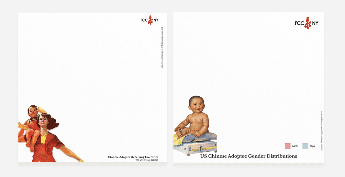
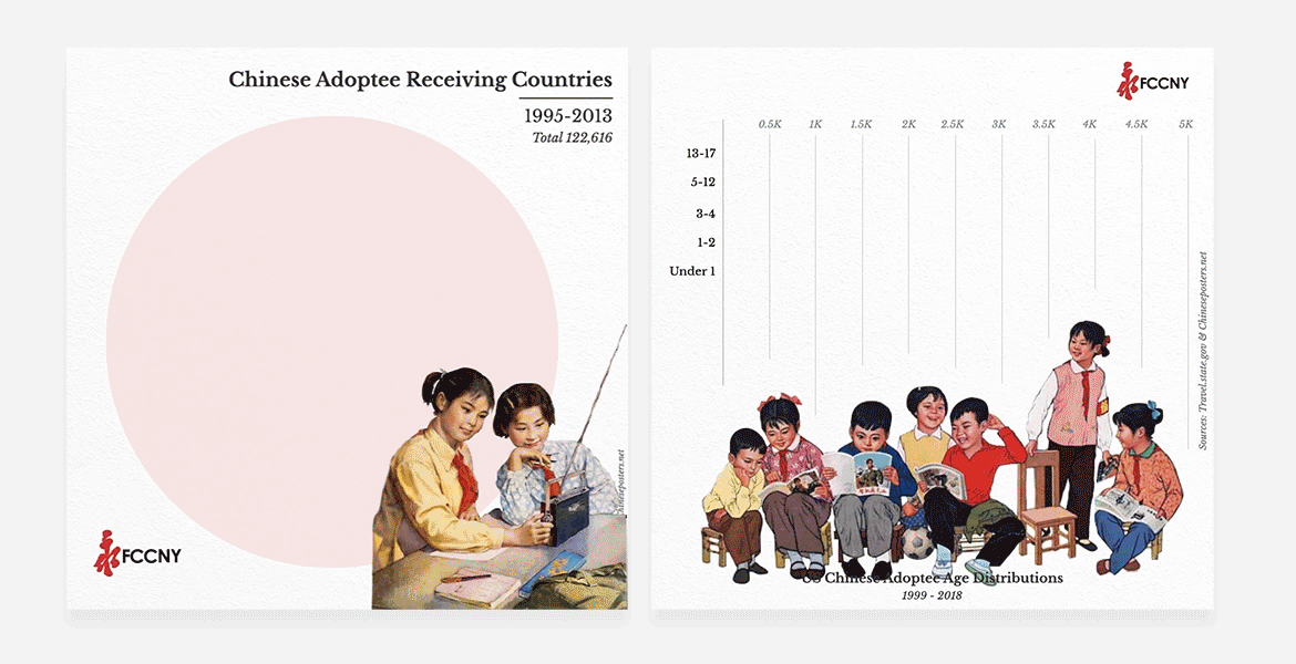
1. TreeMap: each receiving country is shown as a proportion of the total number of Chinese adoptees per year, between 1995 and 2013. Distribution of Chinese adoptees to receiving countries each year, between 1995 and 2013, with each country shown as a proportion of the total number of Chinese adoptions in that year.
2. Gender Pie Graph: The distribution of gender of Chinese adoptees received each year by the US from 1999 to 2018. Over time, there is a general increase in the proportion of boy adoptees, and a general decrease in girl adoptees, with an overall decrease in the total number of adoptions.
3. Packed Bubbles: All countries that received Chinese adoptees between 1995 and 2013, and the total number to each country from the largest (the United States, 84,271) to smallest (Switzerland, 18).
4. Age Distribution Bar Graph: The distribution of ages of Chinese adoptees that were received each year by the US from 1999 to 2018. Over time, there is a general increase in the proportion of older adoptees, while there is a general decrease in the proportion of younger adoptees, with an overall decrease in the total number of adoptions.